Build one consistent color system for light mode and dark mode.
Appearance → Customize → Colors
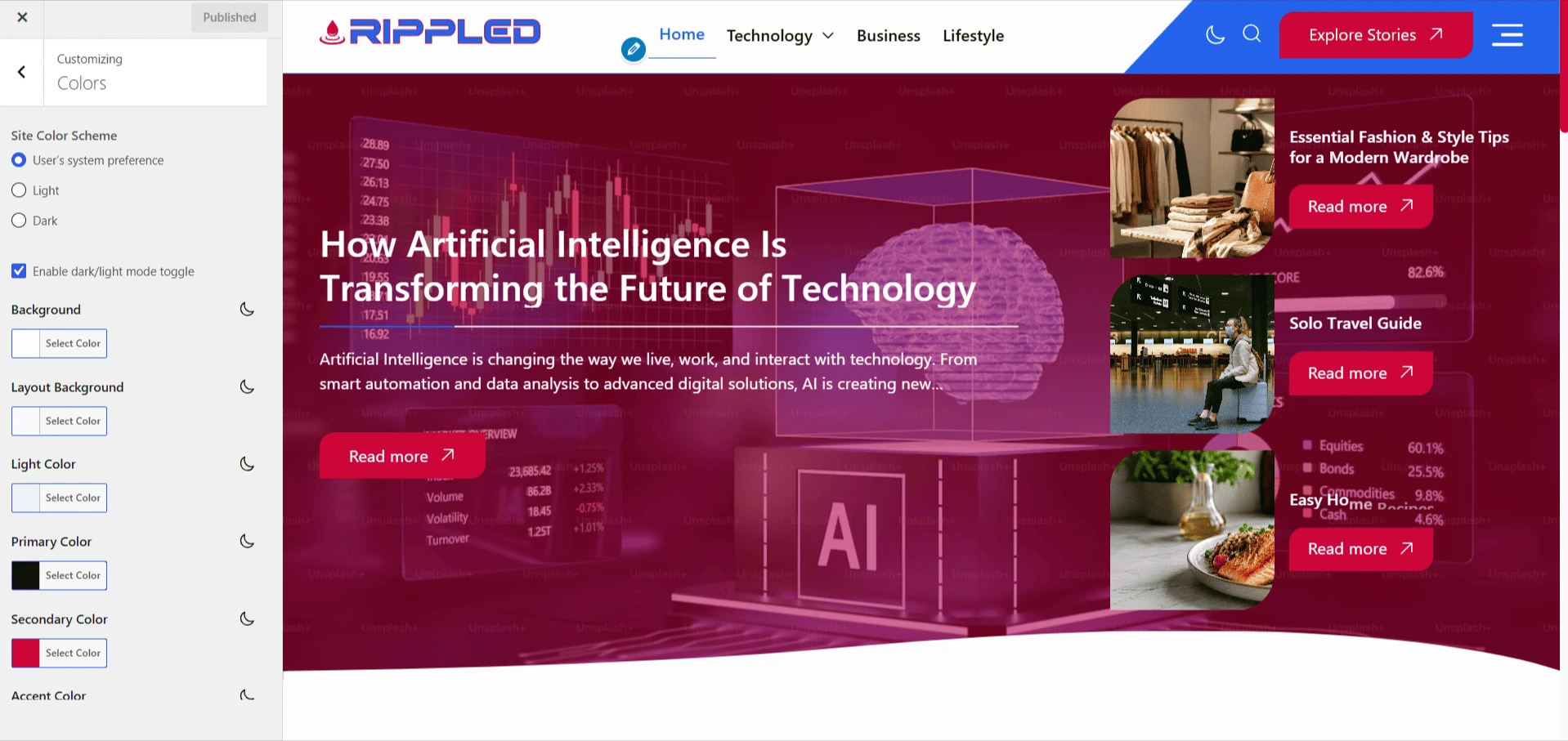
Appearance mode
- Site Color Scheme — Follow the visitor’s system preference, force Light, or force Dark.
- Dark/Light Toggle — Allow visitors to switch the active scheme on the front end.
Surfaces and text
- Background — Outer site background.
- Layout Background — Cards and major content containers.
- Light Color — Soft secondary surface used for subtle contrast.
- Primary and Heading Colors — Body text and heading colors for both schemes.
Brand and interface colors
- Secondary Color — Main brand or emphasis color.
- Accent Color — Links, focus states, decorative lines, and highlights.
- Button Colors — Text, background, hover text, and hover background.
- Overlay Colors — Default and hover tints for hero and featured images.
- Divider Colors — Standard and animated separators.
Note
Use the moon icon beside a color control to edit its dark-mode value. Review contrast in both schemes.